
Office Door Signs: Practical, Professional Solutions for Your Workspace
TL;DR: Office door signs improve navigation, reinforce branding, and support accessibility. Choose materials like acrylic, metal, or wood based on style and durability. Follow ADA guidelines for inclusivity. Install easily with basic tools. Customize colors, fonts, and layouts to match your brand. Consider eco-friendly options and modern trends for a professional look.
First impressions start at the door. Well-designed office door signs do more than identify rooms, they guide visitors, reinforce your brand, and help teams stay organized. This guide covers materials, ADA guidance, DIY installation tips, and design ideas to help you choose signs that look great and work for everyone.
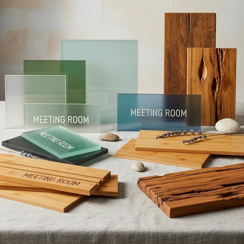
Best Materials for Custom Office Door Signs
Choosing the right material affects longevity, appearance, and cost. Acrylic, metal, and wood each offer different looks: acrylic for versatility, metal for durability, and wood for a warmer, classic feel. Eco-friendly alternatives are also popular for businesses that want to show sustainability commitments.
Acrylic vs. Metal vs. Wood — Which Fits Your Office?
Compare materials by durability, price, and style to find the best fit for your space.
- Acrylic: Lightweight and shatter-resistant. Comes in many colors and finishes, so it’s easy to create bold or modern looks.
- Metal: Tough and long-lasting, suitable for indoor and outdoor use. Offers a sleek, professional finish and is typically pricier.
- Wood: Warm, refined appearance for traditional or boutique offices. Less rugged than metal unless sealed for exterior use.
Match the material to daily use, aesthetic goals, and budget to get the best result.
Eco-Friendly Materials for Office Door Signs
Consider these greener options:
- Recycled Acrylic: Keeps the polished look of acrylic while using post-consumer material to reduce waste.
- Bamboo: A fast-growing, renewable material that gives signs a natural, contemporary look.
- Reclaimed Wood: Adds character and reduces demand for new lumber by reusing existing materials.
Eco choices reinforce brand values while delivering attractive signage.
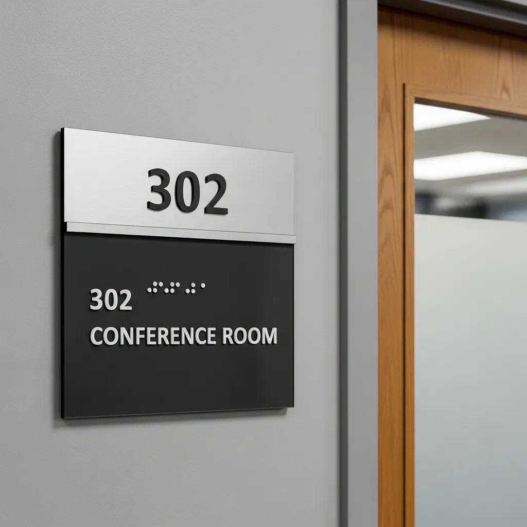
Making Office Nameplates ADA-Compliant
Accessibility matters. ADA-compliant door signs follow specific rules for size, font, contrast, and mounting so people with visual or tactile impairments can read and use them reliably.
Thinking beyond strict requirements, universal design makes spaces easier for everyone to navigate and enjoy, not just those with disabilities.
Universal Design for Accessible Office Spaces
A researcher and international building consultant has worked across topics like universal design, facility planning, building performance, and healthcare environments, emphasizing practical, inclusive solutions for buildings and workplaces.
Key ADA Standards for Office Door Signage
Important ADA requirements include:
- Font Size: Raised letters must be at least 5/8 inch (0.625 inch) tall; braille dots follow ADA sizing and spacing guidelines (commonly 1/10 to 1/8 inch diameter with specified spacing).
- Contrast: High contrast between text and background improves legibility for low-vision users.
- Location: Mount signs so the baseline of the lowest tactile character is at least 48 inches and the highest is no more than 60 inches above the finished floor.
Following these standards helps create an inclusive workplace that meets legal requirements and supports all visitors.
Choosing ADA-Compliant Materials and Fonts
Materials and typography affect readability and durability. Good choices include:
- Acrylic: Smooth surface works well for raised lettering and braille.
- Metal: Durable and easy to engrave to meet tactile requirements.
- High-Contrast Colors: Use dark text on a light background or vice versa for clear visibility.
Stick with simple, sans-serif fonts (like Arial or Helvetica) for the clearest reading at a distance.
Easy Self-Installation Methods for Office Door Signs
Many signs are straightforward to install. With the right tools and a little care, you can mount most nameplates and plaques yourself, no contractor needed.
Tools and Techniques That Simplify Installation
Bring these basics to the job for a clean, professional result:
- Level: Keeps the sign straight and aligned with other fixtures.
- Measuring Tape: Ensures consistent height and spacing across doors.
- Adhesive or Mounting Hardware: Choose mounting that matches the sign material and door surface for a secure fit.
Using proper tools reduces mistakes and saves time.
How to Avoid Common Installation Mistakes
Prevent common issues by following a few simple rules:
- Double-Check Measurements: Measure twice before you drill or apply adhesive.
- Use a Level: Even a slight tilt looks unprofessional next to other signage.
- Follow Manufacturer Instructions: Each material and mounting system has best practices, follow them for longevity and safety.
Taking these steps helps your signs look intentional and last longer.
Creative, Professional Design Ideas for Office Door Signage
Good sign design balances personality and clarity. Thoughtful customization reflects your brand while keeping information easy to read.
Customize Colors, Fonts, and Layouts for Business Doors
Small design choices make a big difference:
- Colors: Use brand colors for recognition; reserve brighter accents for wayfinding and muted tones for corporate areas.
- Fonts: Choose readable faces and mix weights (bold for names, regular for titles) for hierarchy without clutter.
- Layouts: Keep layouts clean with clear visual priority so the eye finds the most important details first.
These choices help signage feel consistent with the rest of your brand and practical for daily use.
Designing corporate signage usually starts with research and sketches: designers compare peers, test color palettes, and refine layouts to ensure strong brand fit and originality.
Corporate Identity Design for Office Signage
Designers review similar organizations, conduct market research, and sketch concepts to avoid repetition and define a unique visual direction. Early steps include choosing colors and initial layout studies before refining the final artwork.
Trending Styles and Finishes for Modern Office Signs
Current signage trends favor simplicity and durability. Popular options include:
- Flat Signs: Minimal, clean designs that blend seamlessly with modern interiors.
- Engraved Signs: Timeless and durable, engraving conveys permanence and polish.
- Mixed Materials: Layering wood, metal, or acrylic creates depth and a custom look.
Picking a style that suits your workplace helps signs feel like an intentional part of the environment.
Office Door Signage Ideas
- Use Iconography: Add simple icons to quickly convey room function, such as a phone for conference rooms or a coffee cup for break areas.
- Incorporate Digital Displays: Use electronic nameplates for dynamic updates and interactive wayfinding.
- Layer Materials: Combine wood and metal for a modern yet warm aesthetic.
- Use Backlighting: Add LED backlighting for visibility in low-light areas and a sleek look.
- Include QR Codes: Link to room schedules or contact info for easy access via smartphones.
- Personalize Employee Doors: Add photos or custom graphics to make individual offices welcoming and unique.
- Use Bold Typography: Make names and titles stand out with large, clear fonts for quick recognition.
- Apply Color Coding: Assign colors to departments or floors to aid navigation.
These ideas help your office door signs be functional, attractive, and aligned with your brand identity.
At Elite Signs To Go, we specialize in custom signage for small and mid-sized businesses. We offer door signs, nameplates, and plaques tailored for professional settings. Our focus is on affordable, high-quality products that are easy to install, so you get great-looking signs without the hassle.
Frequently Asked Questions
What factors should I consider when designing office door signs?
Think about brand consistency, legibility, and accessibility. Use colors that match your brand but keep contrast high. Choose simple, sans-serif fonts and a clear information hierarchy so names and room functions are easy to scan.
How can I incorporate branding into my office door signs?
Include your logo, brand colors, and approved typefaces. Keep proportions and spacing consistent with other branded materials so signage feels like a natural extension of your identity.
What are the benefits of using eco-friendly materials for office signage?
Eco-friendly materials signal environmental responsibility and can differentiate your brand. Options like recycled acrylic, bamboo, and reclaimed wood reduce waste while delivering attractive, durable results.
How do I maintain the quality of my office door signs?
Clean signs regularly with the right products (mild soap for acrylic; manufacturer-recommended cleaners for metal). Inspect mounts and surfaces periodically and repair any wear promptly to keep a polished, professional look.
Can I use digital signage for office door displays?
Yes. Digital nameplates let you update names, hours, and messages instantly and look modern. Consider upfront cost, power needs, and ongoing maintenance when choosing digital over static options.
What are some common mistakes to avoid when designing office door signs?
Avoid overly decorative fonts, poor contrast, and cluttered layouts. Don’t skip ADA considerations. Keep designs simple and purposeful so signs are readable and functional.
Conclusion
Office door signs are a small but powerful way to improve navigation, strengthen your brand, and make your space more welcoming. Choose materials and designs that suit your style, follow ADA guidance where required, and use easy installation methods to get professional results quickly. Ready to upgrade your workspace? Explore our customizable options and let us help you find the right sign for every door.