Vintage Open Face Channel Letters: Retro Signage with Modern Performance
Vintage open face channel letters pair bold, three-dimensional lettering with exposed lighting to create storefront signs that show personality and read clearly day or night. This guide explains what open face channel letters are, why vintage and retro looks still connect with customers, and how exposed neon or LED tubing creates that warm, period-accurate glow. You’ll find practical guidance on material selection, fabrication details that indicate quality, and a straightforward comparison of neon versus LED so you can pick the right solution for your storefront. We also cover which businesses see the biggest benefit, typical cost and maintenance considerations, and how a production partner can support design, engineering, and delivery. Expect clear comparisons, helpful material and maintenance tables, and real-world tips to plan an exposed-illumination sign for building facades, interiors, or marquee installs.
What Are Vintage Open Face Channel Letters and Why Choose Them?
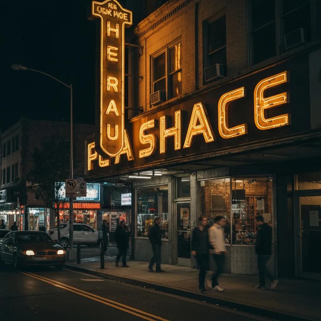
Open face channel letters are three-dimensional signs with the front left open so the lighting—glass neon or LED rope/tubes—is visible. That exposed illumination creates a strong silhouette and a luminous object that reads as both text and art. Businesses pick this style to add genuine retro character, highlight hand-crafted details, and create a focal point that photographs well for social media and signage-driven storytelling. The open face approach also lets designers show off tube routing, choose warmer color temperatures, and use decorative finishes that evoke a period look while staying functional after dark. Comparing open face letters with other channel-letter types makes it clear why this method is the go-to when vintage aesthetics and direct illumination matter most.
How Do Open Face Channel Letters Differ from Other Sign Types?
The main difference is the missing translucent face: open face letters leave the light source exposed for a more textured, direct glow. Typically, returns (often aluminum) form the letter profile while the front stays open for visible tubes or bulbs. By contrast, front-lit letters use acrylic faces to diffuse light, and reverse-lit letters have a sealed back to create a halo effect.
Installation and upkeep also vary. Open face signs need careful tube routing and weatherproofing because elements are exposed; front-lit signs focus on sealed faces and diffusers. Costs change depending on the lighting medium—hand-bent neon or custom LED rope—and on how much customization you want. Those trade-offs matter when you’re balancing durability, authentic appearance, and maintenance needs.
What Makes Vintage and Retro Styles Popular for Business Signage?
Vintage and retro signage stay popular because they tap into nostalgia, authenticity, and distinctiveness—qualities that make storefronts memorable. People respond to tactile, well-made visuals that suggest heritage or a carefully curated atmosphere, so retro open face channel letters work especially well for hospitality and specialty retail. Trends favor experiential retail and “Instagrammable” moments, where a well-crafted sign doubles as wayfinding and marketing. Designers lean into warm neon tones, period-appropriate type, distressed metal finishes, and marquee layouts to suggest a specific era while keeping modern reliability and energy efficiency in mind.
How Does Exposed Illumination Enhance Vintage Open Face Channel Letters?
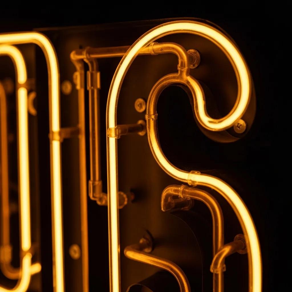
When the light source is visible, letters stop being flat copy and become sculptural elements. Exposed tubes or LED ropes add depth through glowing contours, visible tube silhouettes, and intentional color choices—qualities that reinforce a vintage look and draw attention after dark. Choosing between neon and LED affects how authentic the sign looks, how much energy it uses, and how it’s maintained: neon gives that classic glass-tube richness but needs specialized servicing; LED delivers efficiency and long life with modern color-matching. Below is a focused comparison to help you weigh those trade-offs for open face projects.
Different illumination technologies affect appearance, energy use, lifespan, and upkeep in distinct ways:
| Illumination Type | Characteristic | Typical Value |
|---|---|---|
| Neon | Look / Authenticity | Warm, saturated colors; iconic glass tube glow |
| Neon | Lifespan (hours) | Typical range: 8,000–15,000 hours |
| Neon | Maintenance | Higher: tube servicing, transformer checks |
| LED | Energy Use | Lower energy consumption per lumen |
| LED | Lifespan (hours) | Typical range: 50,000–100,000 hours |
| LED | Maintenance | Lower: occasional driver or waterproofing checks |
That table sums up the trade-offs: neon wins on authentic look, LED wins on lifecycle efficiency and lower routine servicing. Most designers balance visual impact against long-term costs when specifying exposed illumination.
What Are the Benefits of Neon vs. LED for Open Face Channel Letters?
Both technologies bring strengths that influence how the sign will look, operate, and be serviced.
Neon gives unmatched color depth, continuous glass-tube silhouettes, and the warm glow many retro projects demand—making it the right choice when period-accuracy is the priority. The downside is a shorter lamp life and the need for specialized repairs.
LED recreates neon-style lines with flexible rope or “neon-effect” modules. LEDs have much longer life, lower energy use, and simpler replacement parts. Modern LEDs can get very close to neon hues, so they’re a practical alternative when uptime and cost of ownership matter most.
In short: choose neon for exact vintage fidelity; choose LED for operational efficiency and easier maintenance.
How Does Exposed Lighting Create a Distinctive Retro Look?
Visible tubes, warm color temperatures, and carefully routed paths give open face letters their retro character. Tube silhouettes near the letter edge create a glow and subtle halo that reads as authentic vintage light, while warm whites, ambers, and saturated primaries match classic palettes.
Designers control tube path, spacing, and font weight so the lighting becomes part of the letterform. Finishes like aged metal or patinaed powder coat pair with the illumination to create a cohesive, historic feel. Together, these choices turn a logo or wordmark into an atmospheric centerpiece that stands out both day and night.
What Materials and Craftsmanship Define Quality Vintage Open Face Channel Letters?
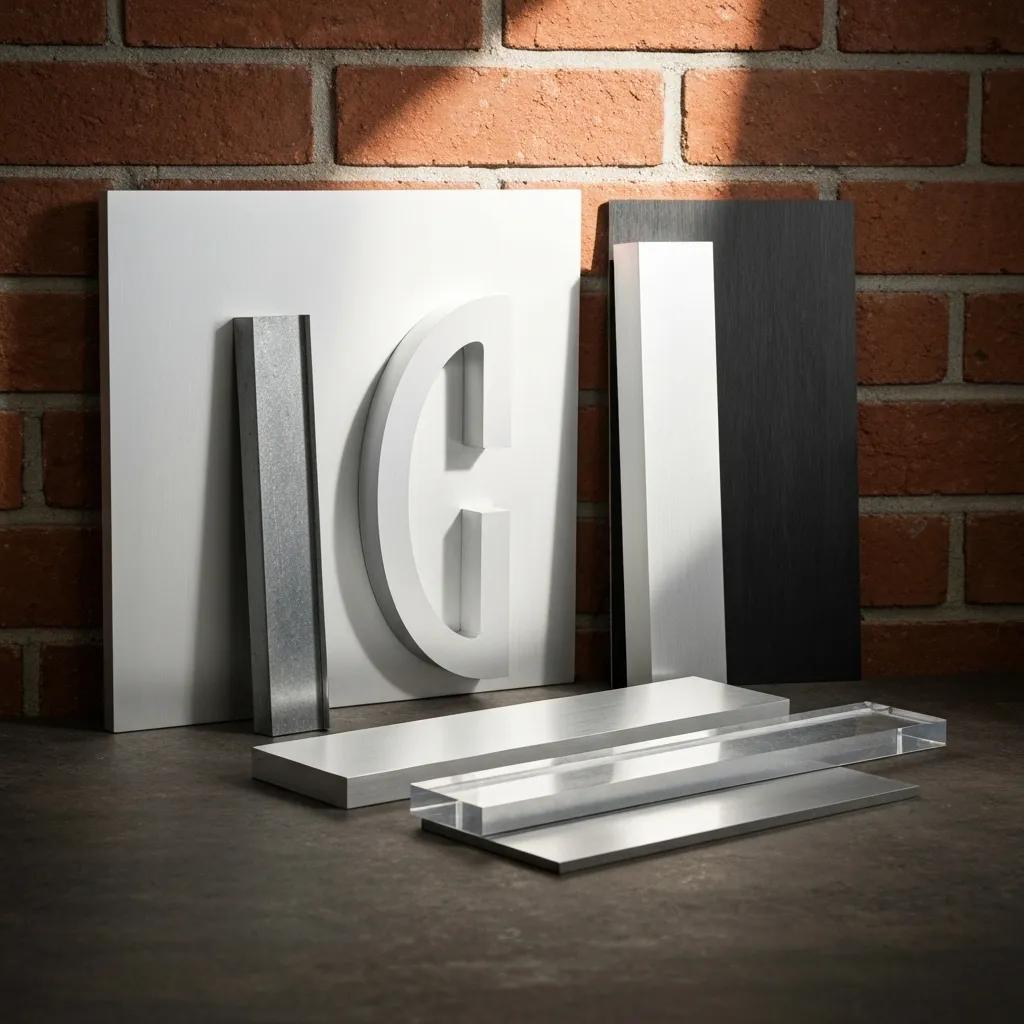
Top-quality open face letters start with the right materials, precise fabrication, and finishes that protect exposed illumination while keeping the vintage look. Aluminum returns are common because they’re lightweight and resist corrosion; steel is used where extra strength is needed. Powder coat and brushed metal finishes help achieve period-correct textures. Look for craftsmanship signs like clean welds, neatly routed tube channels, sealed electricals, and mounting hardware designed to preserve the open face appearance without exposing wiring. When these standards are met, you get a sign that looks authentic and holds up to the elements with routine maintenance.
Below is a materials comparison to clarify attributes that affect durability and finish choices:
| Material | Durability | Finish Options |
|---|---|---|
| Aluminum | Lightweight, corrosion-resistant | Powder coat, brushed, anodized |
| Acrylic (accents) | Color/translucency options for accents | Colored or opal acrylic accents where used |
| Steel | High strength, heavier | Painted or plated finishes; used selectively |
This comparison shows why aluminum usually handles returns and structural parts, while acrylic and steel are used for accents or strength where needed. Material choice affects weight, weather resistance, and how easily you can achieve distressing or patina effects.
Why Are Aluminum and Acrylic Preferred for Vintage Channel Letters?
Aluminum and acrylic hit the right balance of weight, corrosion resistance, and finish options for exposed-illumination letters. Aluminum forms precise returns, takes powder coat and specialty finishes well, and won’t rust—ideal for exterior letters that showcase exposed tubes. Acrylic is handy for accents or partial faces where you want controlled diffusion or color. Steel is an option when extra rigidity is required, but its weight and corrosion profile usually make aluminum the default for vintage open face builds. Those material properties steer the decisions you’ll make about customization and branding.
How Does Customization Support Unique Brand Identity?
Customization aligns letterforms, lighting, and finishes with your brand story so the sign becomes a recognizable asset. Options include custom fonts and logo integration, bespoke tube routing that echoes brand motifs, era-appropriate color palettes, and finish techniques like hand-distressing or layered patinas to suggest age. Engineering-stamped renderings, thorough proofing, and mockups help ensure the finished sign matches the visual and structural intent. Good customization not only differentiates a storefront but ties signage into interiors, packaging, and social channels.
Common customization options that shape brand identity include:
- Custom Fonts and Logos: Tailored letterforms that reflect your voice.
- Tube Routing Patterns: Distinct light paths that add signature detail.
- Finish Treatments: Patina, powder coat, or brushed metal to suggest age.
When chosen deliberately, these options deliver a sign that’s both a marketing tool and a lasting piece of visual branding. The next section explains which business types get the most value from vintage treatments.
Which Businesses Benefit Most from Vintage Open Face Channel Letters?
Some businesses see outsized returns from vintage open face letters because the signs match atmosphere, audience, and hours of operation. Bars and restaurants use exposed illumination to set mood and signal evening activity; boutique retailers and breweries use tactile lettering to communicate handcrafted quality. Retro signs also work well for theaters and specialty food shops that rely on discovery and social sharing. Matching scale, color, and placement to sightlines and brand story helps owners boost foot traffic and recall.
Businesses that commonly benefit include:
- Bars and Nighttime Venues: Vintage glow draws evening crowds.
- Restaurants and Diners: Retro signage supports a curated atmosphere.
- Boutiques and Breweries: Distinctive letters reinforce artisanal positioning.
These businesses often pair exterior facade signs with interior pieces to extend the brand from the street to the dining room. The following subsection explains why hospitality and retail are especially well suited to retro illuminated signage.
Why Are Bars, Restaurants, and Retailers Ideal for Retro Illuminated Signs?
Retro illuminated signs create atmosphere, improve nighttime visibility, and act as landmarks that invite foot traffic. Interior open face letters become focal points that reinforce decor and fuel social shares, while exterior signs tell passersby you’re open and give a strong first impression. For retailers, a vintage sign helps a storefront stand out in busy shopping areas and encourages impulse visits. Practical considerations—mounting location, weather exposure, and local codes—determine whether letters are flush-mounted or installed on a raceway to simplify wiring and maintenance.
How Do Vintage Signs Improve Commercial Visibility and Customer Attraction?
Vintage signs stand out because their shapes, exposed illumination, and color contrast cut through storefront clutter. The three-dimensional presence of channel letters reads farther than flat signs, and the visible glow draws attention in low-light conditions, when conversions often happen. Beyond visibility, a well-executed retro sign signals craft and authenticity—qualities that increase dwell time and social sharing. Proper placement, scale for sightlines, and coordinated lighting make the sign a reliable conversion tool rather than just decoration.
How Does Elite Signs To Go Manufacture and Support Vintage Open Face Channel Letters?
Elite Signs To Go is a custom sign fabricator focused on affordable, well-made signage with fast turnaround and design services that include engineering-stamped renderings. Their product line covers banners, A-frame stands, canvas, and multiple channel-letter styles; the site highlights front-lit trimmed channel letters among its offerings. The company emphasizes design consultation and delivers engineering-stamped renderings to support approvals and installation planning. Their “Built By Us, Installed By You!” approach ships finished signs ready for customer-managed installation, aiming to balance quality fabrication with cost-effectiveness.
Their workflow starts with a project brief and moves through proofing and fabrication. Engineering-stamped renderings provide the technical detail needed for permitting and structural conversations, and quick turnaround helps businesses meet opening dates or refresh schedules. Because Elite Signs To Go focuses on producing finished sign units, their model fits customers who want to handle installation locally or with their own crew. This production-first setup reduces procurement steps for owners who need high-quality, install-ready vintage open face letters built to spec.
What Is the Design Consultation and Engineering Process?
Design consultation typically begins with a brief outlining branding goals, the vintage look you want, dimensions, and mounting constraints. The fabricator then produces proofs and engineering-stamped renderings for review. Those stamped drawings give the technical detail required for permits and ensure letters meet structural requirements—so clients feel confident before fabrication starts. After approvals, fabrication begins and quality checks verify tube routing, finishes, and electrical components. The consult → render → approve → fabricate sequence helps reduce rework and keeps design and manufacturing aligned.
How Are Fabrication, Quality Assurance, and Installation Handled?
Fabrication focuses on accurate metalwork, precise tube routing, and protective finishes that preserve exposed illumination without sacrificing appearance. Quality assurance checks include secure electrical connections, correctly placed transformers where needed, and consistent finish application to resist corrosion. When the manufacturer builds the letters and the customer installs them, documentation and packed mounts are included to streamline on-site mounting while leaving installation to the client. That approach lowers on-site labor costs and delivers signs that arrive production-ready with clear craftsmanship markers and engineering paperwork.
What Are the Typical Costs, Maintenance, and Lifespan of Vintage Open Face Channel Letters?
Cost and lifespan depend on drivers like illumination type, size, materials, level of customization, and installation method. Neon usually has higher fabrication and specialist installer costs and shorter lamp life, while LED delivers better energy efficiency, longer operation, and lower routine service needs. Maintenance expectations differ: neon may need periodic tube servicing and transformer checks; LED often requires driver or module replacement much less frequently and attention to waterproofing. For exact pricing and engineering-stamped renderings, manufacturers like Elite Signs To Go offer quotes that translate your project details into a formal estimate.
Below is a cost-driver matrix showing how components influence price, lifespan, and maintenance:
| Sign Component | Cost Driver | Impact |
|---|---|---|
| Illumination (Neon vs LED) | Labor & materials | Neon raises fabrication and service costs; LED raises initial material cost but lowers energy and service costs over time |
| Materials (Aluminum, Steel) | Weight and finish | Heavier or specialty materials increase fabrication complexity and price |
| Customization | Font complexity, tube routing | More bespoke routing and finishes increase labor hours and cost |
| Installation method | Raceway vs flush mount | Raceway simplifies wiring but may add material cost; flush mount can increase labor for facade prep |
How Do Open Face Channel Letters Compare in Cost to Other Sign Types?
Open face letters can cost more than front-lit or reverse-lit types when you use hand-bent neon or complex tube routing, though LED options narrow that gap by offering neon-like profiles with lower labor. Front-lit acrylic-faced letters follow predictable fabrication paths and have sealed electronics, which can reduce servicing. Reverse-lit halo letters need careful backer design but hide wiring. Installation choices—raceway mounting for transformers versus individual mounting—also shift upfront and long-term costs. Buyers should weigh the premium for authentic exposed illumination against ongoing operational expenses to find the best value.
What Maintenance Is Required for Neon vs. LED Vintage Signs?
Routine maintenance keeps open face channel letters looking their best and extends component life; exact tasks vary by illumination type and exposure. Neon upkeep centers on inspecting glass tubes for cracks, checking transformers, and scheduling professional tube servicing when brightness or color changes. LED maintenance focuses on driver life, preserving waterproof seals, and replacing LED modules or connectors as needed—typically far less often than neon. Regular cleaning, tightening checks for mounting hardware, and seasonal visual inspections are practical steps to preserve performance and safety.
A practical maintenance checklist includes:
- Visual Inspection: Monthly check for cracked tubes, loose mounts, or water intrusion.
- Cleaning: Gentle surface cleaning quarterly to remove grime that dims the glow.
- Electrical Check: Annual verification of transformers (neon) or drivers (LED) by a qualified technician.
- Protective Upkeep: Reapply sealants or touch up finishes as needed to prevent corrosion.
Following a consistent maintenance rhythm reduces surprises and keeps the sign’s vintage look and legibility intact. For an accurate estimate that reflects your project’s specifics, request a formal quote and engineering-stamped renderings to plan lifecycle costs.
For project inquiries or to contact Elite Signs To Go about affordable, well-made signs and quick turnaround, reach out through our contact page.
Frequently Asked Questions
What are the key factors to consider when choosing between neon and LED for vintage open face channel letters?
Decide based on visual goals, energy use, lifespan, and maintenance. Neon gives richer, classic colors and an authentic glass-tube look but needs specialist servicing and has a shorter life. LED delivers long life, lower energy use, and easier upkeep, and modern LEDs can closely match neon tones. Match the choice to your brand’s visual priority and your operating budget.
How can businesses ensure their vintage open face channel letters comply with local signage regulations?
Start by checking your municipality’s zoning and sign ordinances for rules on size, illumination, and placement. Work with a fabricator who knows local codes and can produce engineering-stamped renderings for permitting. Early engagement with local authorities helps avoid costly redesigns and keeps your project on schedule.
What maintenance practices are essential for preserving the appearance of vintage open face channel letters?
Regular cleaning and inspections are key. Clean surfaces quarterly to remove dirt that mutes the glow. Do monthly visual checks for cracked tubes or loose mounts. For neon, inspect transformers annually; for LED, have drivers checked on schedule. Reapply protective sealants and touch up finishes as needed to prevent corrosion.
How do customization options impact the cost of vintage open face channel letters?
Customization—unique fonts, intricate tube routing, specialty finishes—raises labor and material costs. The more complex the design, the higher the fabrication time and price. Thoughtful customization, however, strengthens brand identity and can be a worthwhile investment when it supports marketing and customer experience.
What role does lighting placement play in the effectiveness of vintage open face channel letters?
Placement affects visibility and atmosphere. Proper positioning enhances three-dimensionality and ensures tubes are visible from key sightlines, especially in low light. Consider surrounding architecture, sightlines, and local lighting rules when choosing placement. Good placement improves legibility and helps attract customers after dark.
What are the environmental considerations for installing vintage open face channel letters?
Consider weather resistance, energy use, and material sustainability. Durable materials like aluminum resist harsh conditions; LED lighting reduces energy use and waste due to longer life. Choose recyclable materials and energy-efficient illumination where possible, and ensure installation methods account for local climate to maximize longevity.
Conclusion
Vintage open face channel letters deliver a blend of nostalgia and clear visibility that suits many brands. With exposed illumination and careful craftsmanship, these signs attract attention and create memorable customer moments. Investing in customized vintage signage can boost foot traffic and brand recognition—our team is ready to help you design a sign that captures your story and performs reliably.